ShopDreamUp AI ArtDreamUp

Deviation Actions


Description
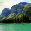
Another photo from Engineer Pass in Colorado.
I'd love to hear some feedback about what you guys like or don't like, and things I can do better both in taking the photo and editing it!
Image size
3822x2036px 7.28 MB
Make
Canon
Model
Canon EOS 60D
Shutter Speed
1/320 second
Aperture
F/10.0
Focal Length
12 mm
ISO Speed
200
Date Taken
Aug 9, 2013, 9:05:20 AM
© 2013 - 2024 KRHPhotography
Comments37
Join the community to add your comment. Already a deviant? Log In
I'll start this critique by saying that overall, this image really pops! It is really impactful, and appealing!
You have brought great interaction between the highlights and the shadows. Additionally, you have found a great balance between sharpness and softness. The dirt and gravel of the road retain a rather hard feeling, while the grass seems to be softer and more inviting.
Compositionally, the road is fantastic! For me, it is placed just right on the left side of the image, and the way it winds through the hills going across the image from left to right, as it disappears into the horizon is stunning! It's a real focal point for my eye.
Though, there are a couple of areas that I might tweak, if this were my image. While the colors overall are vivid and wonderful, I do think that the sky is a little too blue, or perhaps a little too light. The bright saturated blue in the sky is a bit distracting for me. I might increase the levels of black in the sky, so that you retain a saturated, but darker color. One that is just slightly less vivid, and doesn't distract the eye as much. The other area of critique that I have is the vertical composition of the image. The sky/clouds are taking up nearly half of the image, which feels like too much to me. If I were cropping it, I would probably crop just underneath the cloud in the upper right corner. That would do a couple things: It would make the clouds in the center left appear to fill the sky more, it would not place as much emphasis on the sky as is done now, and it would turn this image into a slightly panoramic format, which I think could really add another level of appeal to the piece.
For me, the ground and road are insanely interesting, and well done. In my opinion, addressing those two issues with the sky would take this piece from a 9.5 to a 10.